ABM Sheets Documentation
Vít Ungermann
Faculty of Mathematics and Physics
Charles University
Prague, Czech Republic
Table of Contents
- Introduction
- ABM Sheets graph functions
- Coordinates: Continuous and categorical coordinates
- Scales: Categorical and continuous
- Basic shapes
- Specifying visual properties
- Transforming scales
- Combining shapes and axes
- Rendering charts
- Walkthrough demo with examples
- References
Introduction
This documentation gives you an overview of the graph functions in the ABM Sheets application.
Each function has its parameters described, and some of them have examples for you to better understand the nature of rendering graphs in this environment.
Graph functions
ABM Sheets uses CompostJS for rendering graphs, which is a library designed to render graphs in a functional programming–like style.
It also provides the user with a system of coordinates that is explained below and a system of scales that lets the user directly change the default scaling.
The following sections describe all of the primitives used to put together complex and fully customizable graphs. Each function has a description, types of input parameters, and the produced output type.
At the end, there will be a step-by-step tutorial with examples for creating a demo that utilizes all of the primitives.
Note: The words graph and chart may be used interchangeably.
Coordinates: Continuous and categorical coordinates
When specifying coordinates, you do so using a value from your domain rather than using a value in pixels. A value can be either categorical (such as a political party or a country) or continuous (such as an exchange rate or a year).
When specifying a location using a continuous value, you specify just a number. When using a categorical value, ABM Sheets associates a whole area with each category, and so you need to give a category together with a number specifying a location within this area. The following are valid ways of specifying a Coord:
EXAMPLE OF COORDINATES
Continuous values are simple numbers; they can represent things such as the size of a population or the number of cars in the city.
The categorical values represent a point in an area associated with a categorical value.
CATEGORICALCOORD(Labour, 0)→ This represents the leftmost corner of an area associated with the categorical valueLabour.CATEGORICALCOORD(Labour, 0.5)→ This represents the middle of an area associated with the categorical valueLabour.
In other words, Coord can be either a number or an array of two elements containing a string (the name of the category) and a number (between 0 and 1).
When you want to specify a location on a chart, you need an x and y coordinate. A Point in the following documentation refers to an array of two Coord elements, one for the x and one for the y coordinate.
EXAMPLE OF VALID POINTS
POINT(5, 10)→ A pair of continuous values.POINT(CATEGORICALCOORD(Labour, 0.5), 10)→ A point with categorical X and continuous Y.
Scales: Categorical and continuous
The following functions create a Scale object that can then be passed through some of the scale-transforming functions to modify the scales.
- SCALECONTINUOUS
Creates a continuous scale that can contain values in the specified range.float,float→Scale
- SCALECATEGORICAL
Creates a categorical scale that can contain categorical values specified in the given range of strings.string[ ]→Scale
Basic shapes
-
TEXT
Draws text specified as the third parameter at given x and y coordinates specified by the first two parameters. The last two optional parameters specify alignment (baseline, hanging, middle, start, end, center) and rotation in radians.Point,string,?string,?float→Shape
-
BUBBLE
Creates a bubble (point) at specified x and y coordinates. The last two parameters specify the width and height of the bubble in pixels.Point,float,float→Shape
-
SHAPE
Creates a filled shape. The shape is specified as an array of points (see the section on coordinates).Point[]→Shape
-
LINE
Creates a line drawn using the current stroke color. The line is specified as an array of points (see the section on coordinates).Point[]→Shape
-
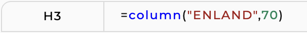
COLUMN
Creates a filled rectangle for use in a column chart. This is a shorthand forSHAPE. It creates a rectangle that fills the whole area for a given categorical value and has a specified height.string,float→Shape
-
BAR
Creates a filled rectangle for use in a bar chart. This is a shorthand forSHAPE. It creates a rectangle that fills the whole area for a given categorical value and has a specified width.float,string→Shape
Specifying visual properties
-
FILLCOLOR
Sets the fill color to be used for all shapes drawn usingSHAPEin the given shape.string,Shape→Shape
-
STROKECOLOR
Sets the line color to be used for all lines drawn usingLINEin the given shape.string,Shape→Shape
-
FONT
Sets the font and text color to be used for all text occurring in the given shape.string,string,Shape→Shape
Transforming scales
-
NEST
Creates a shape that occupies an explicitly specified space using the four coordinates as left and right X values and top and bottom Y values. Inside this explicitly specified space, the nested shape is drawn, using its own scales.Point,Point,Shape→Shape
-
NESTX
Same as above, but this primitive only overrides the X scale of the nested shape while the Y scale is left unchanged and can be shared with other shapes.Coord,Coord,Shape→Shape
-
NESTY
Same as above, but this primitive only overrides the Y scale of the nested shape while the X scale is left unchanged and can be shared with other shapes.Coord,Coord,Shape→Shape
-
SCALE
Overrides the automatically inferred scale with an explicitly specified one. You can use this to define a custom minimal and maximal value. To create scales uses.continuousors.categorical.Scale,Scale,Shape→Shape
-
SCALEX
Overrides the automatically inferred X scale (as above).Scale,Shape→Shape
-
SCALEY
Overrides the automatically inferred Y scale (as above).Scale,Shape→Shape
-
PADDING
Adds padding around the given shape. The padding is specified as top, right, bottom, left. This will subtract the padding from the available space and draw the nested shape into the smaller space.float,float,float,float,Shape→Shape
Combining shapes and axes
-
OVERLAY
Composes a given range of shapes by drawing them all in the same chart area. This calculates the scale of all nested shapes, and those are then automatically aligned based on their coordinates.Shape[]→Shape
-
AXES
Draws axes around a given shape. The string parameter can be any string containing the words left, right, bottom and/or top, for example using space as a separator.string,Shape→Shape
Rendering charts
- RENDER
Displays a given chart in theGraphsidebar menu. If you have multiple graphs rendered at the same time (you have more than oneRENDERfunction in your spreadsheet), you can toggle between them in theGraphsidebar.Shape→ Displays chart.
Walkthrough demo with examples
This demo is going to show you examples of using the graph functions and how to put them all together to create a complete chart.
The chart in this demo shows the population size of three countries and a legend.
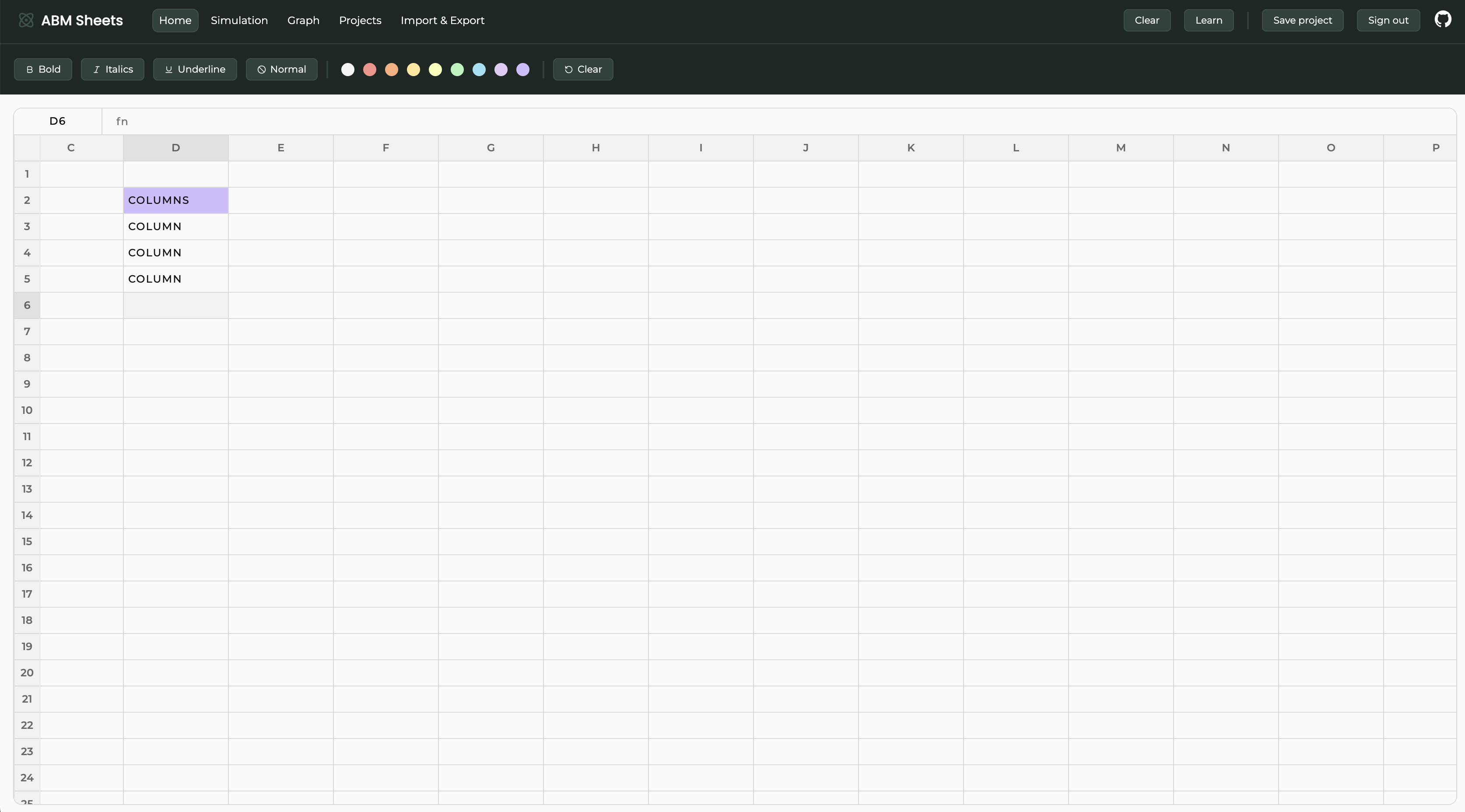
First, we want to create the columns for the respective countries. This is done with the COLUMN function.
This creates a column shape. We can create the other columns in the same way. Your spreadsheet should now look like this.
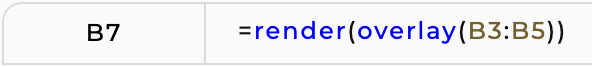
If we put our columns together using OVERLAY and then render the shape with RENDER, it displays this chart.
Not very impressive, but we can do better. Let's add some color and axes.
We can do that using the FILLCOLOR function in which we are going to wrap each column. With the AXES function, we can display axes by wrapping the result shape from the OVERLAY function in it.

When displayed, the chart should now be colorful and have axes.
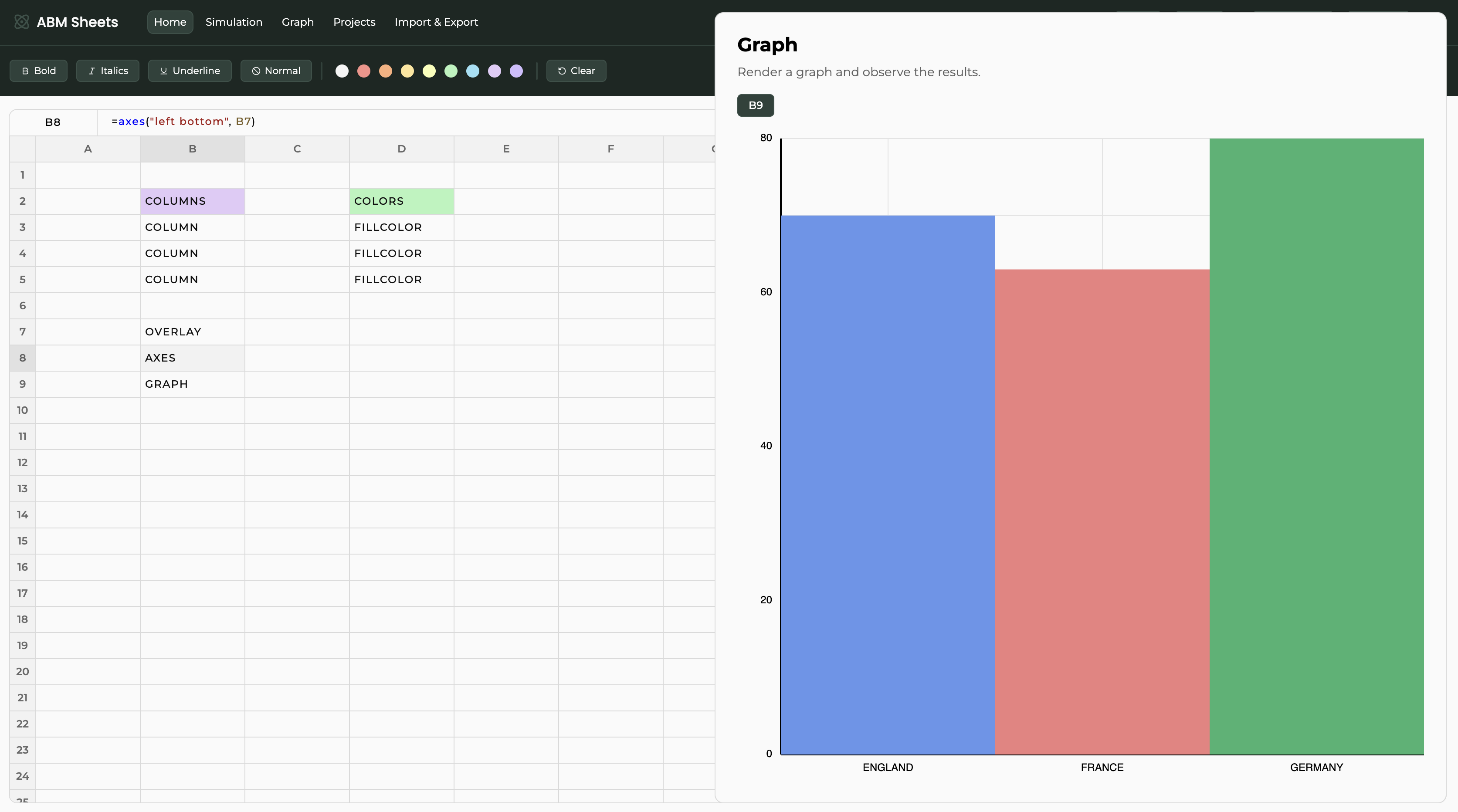
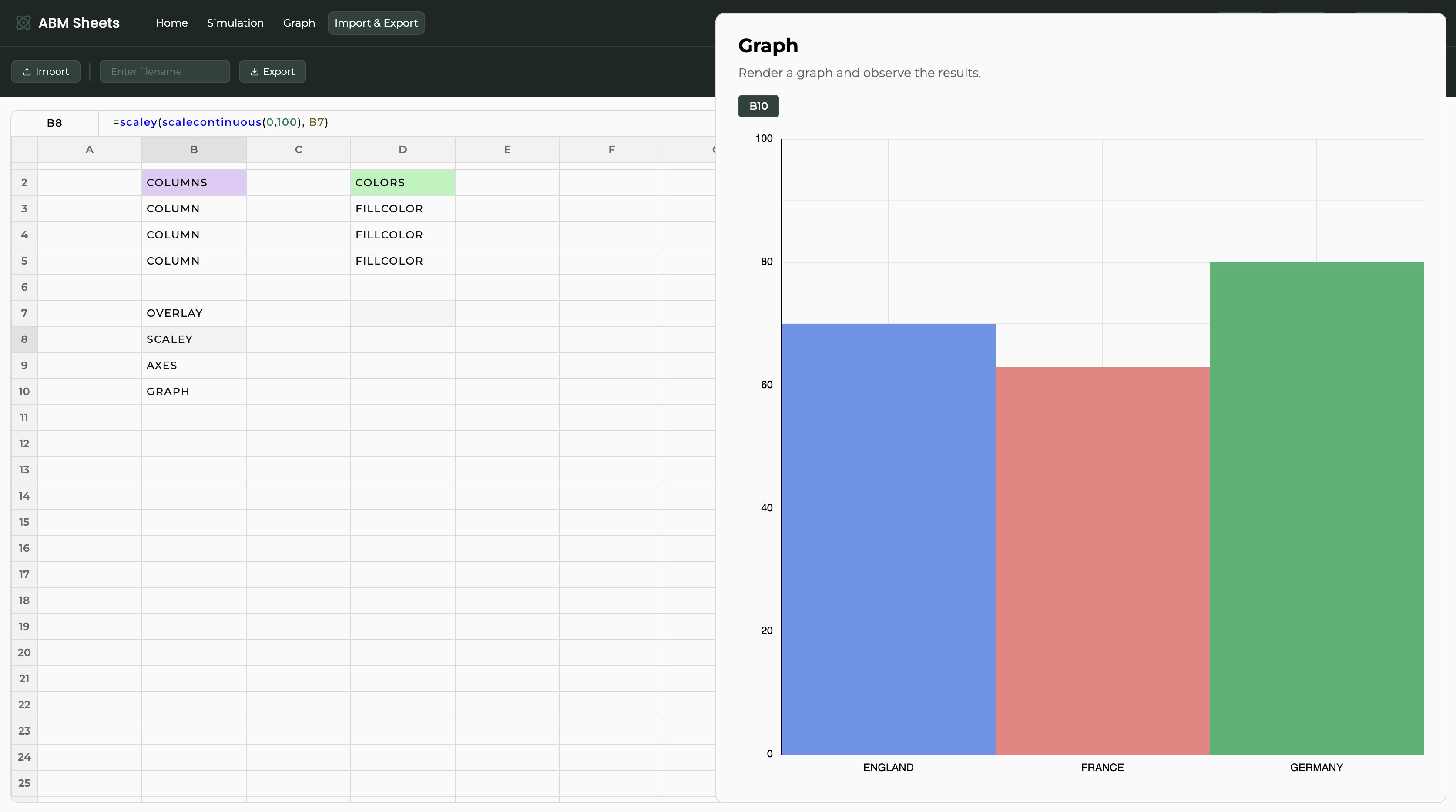
As you can see, the chart has its scales derived from the size of the columns. We can change that using the scale functions.
Let's say that we want to modify the vertical axis. We are going to use the SCALECONTINUOUS and SCALEY functions. Here, the B7 cell contains the overlay of the columns.

And now our graph has a set vertical scale.
We would, however, still like to add the legend. For that, we are going to create another separate chart and then nest the actual graph and the legend.
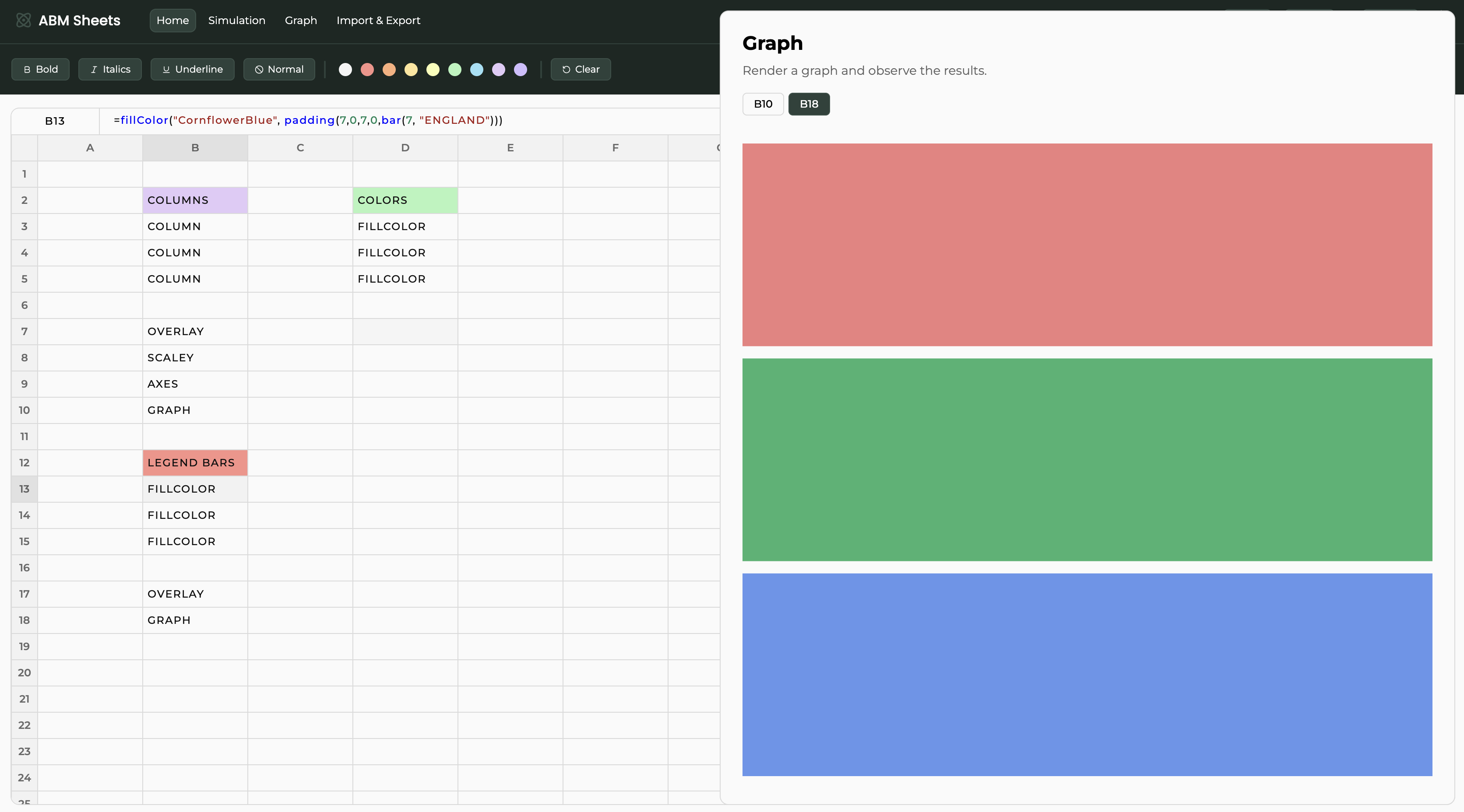
Here, we are creating the colored bars using the BAR and FILLCOLOR functions.

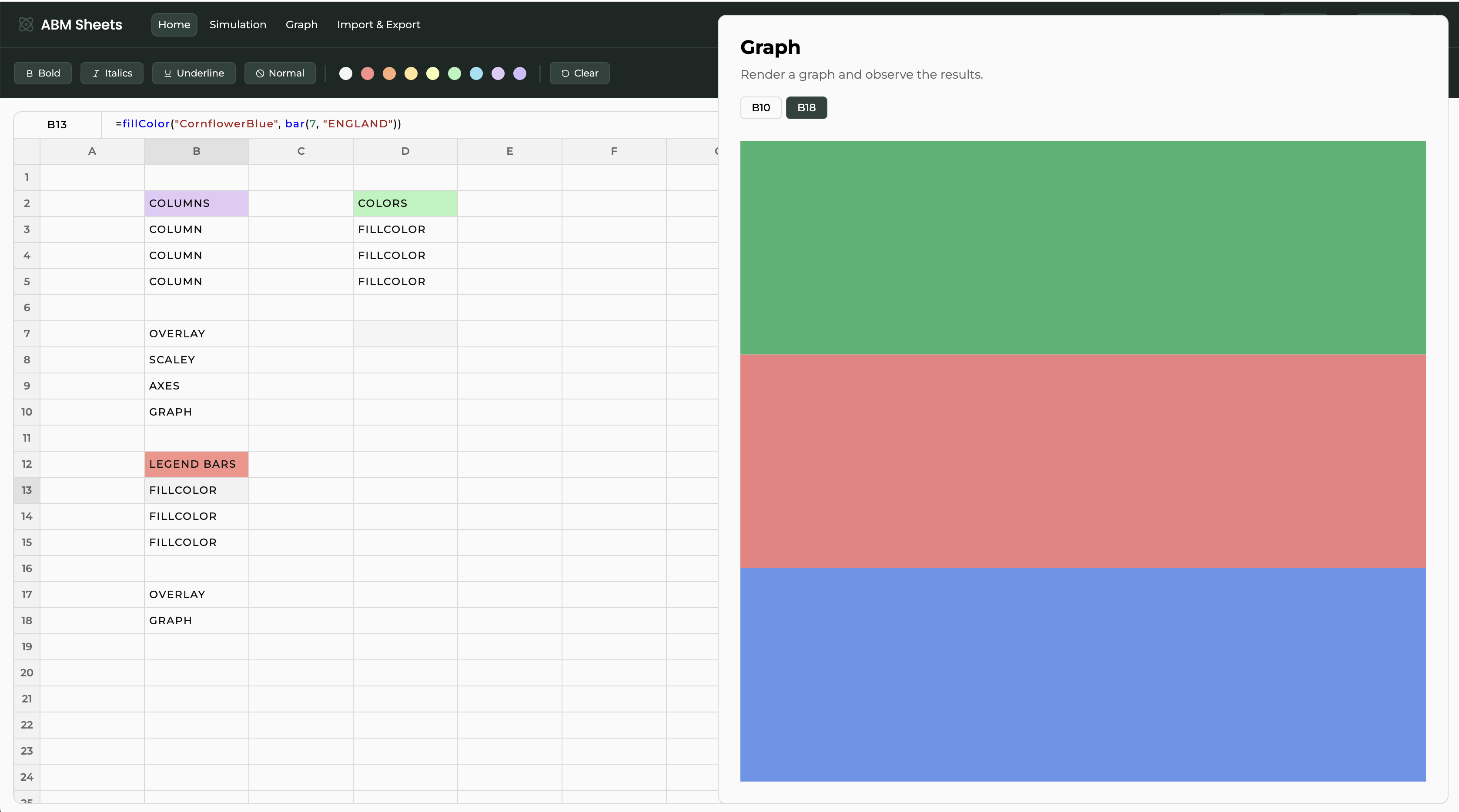
The legend would look better if the bars were a bit spaced out; we can do that with the PADDING function.

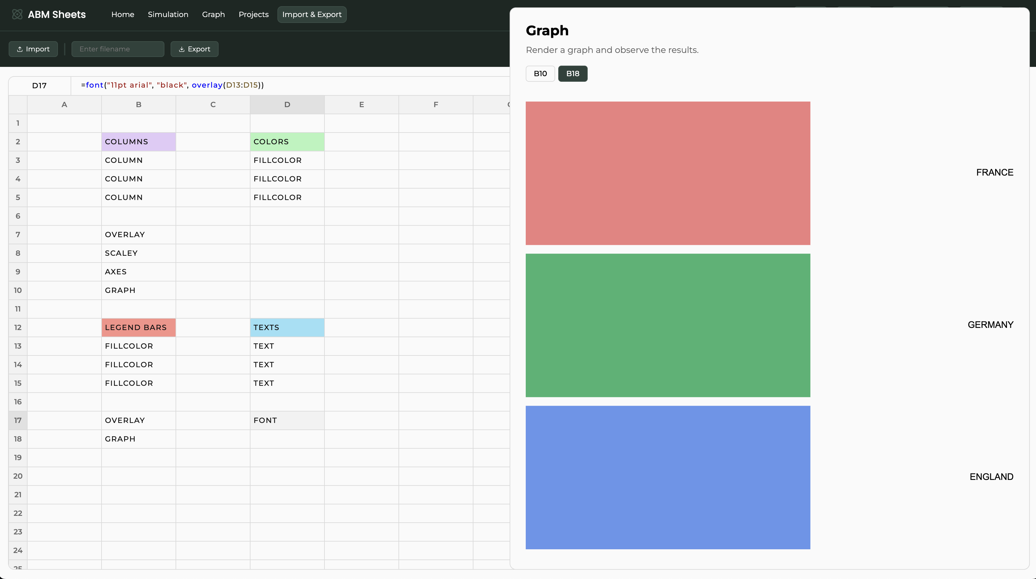
The bars look nice, but we need to add some text. With the TEXT function, we can create the descriptions and position them relative to the bars using the CATEGORICALCOORD, and with the FONT function, we are going to specify how the text will appear.
Positioning the text vertically exactly at the middle of the bar.

Wrapping all of the text in the FONT function and specifying the size and font.

The legend is now complete with the colored bars and their respective text.
The last thing we need to do is specify the respective spaces which the main chart and the legend should occupy.
This is done via the NEST function.
We need to define the area where the shape is going to be contained. We do that by specifying two POINTS, the bottom-left and top-right corners of the said area.
Both of the shapes (the graph and the legend) need to be nested in their respective areas.

Finally, we can display the complete graph with OVERLAY and RENDER.
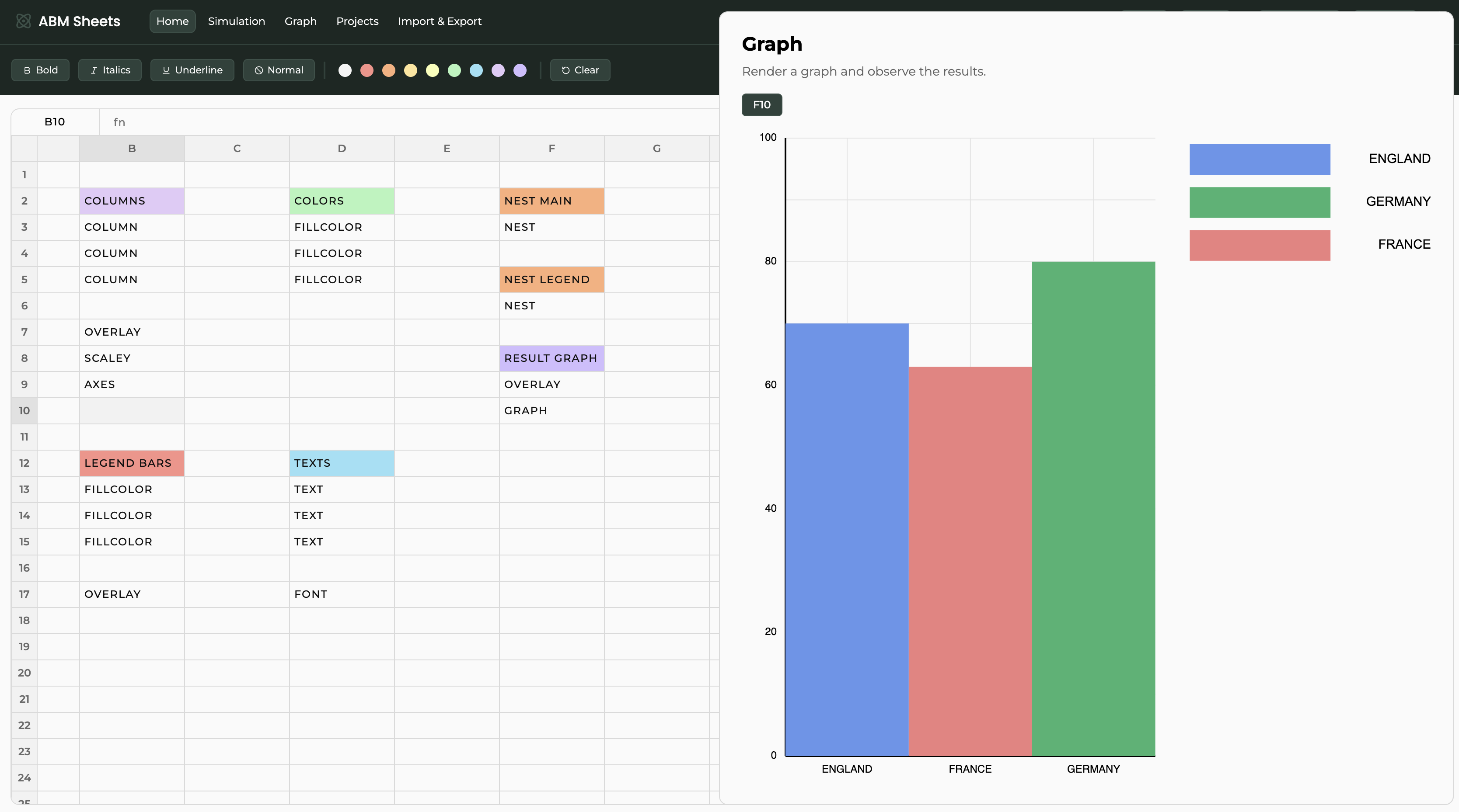
Your spreadsheet and graph should look like this. This demo showcases the highly customizable nature of the graphing environment that ABM Sheets offers.
References
- Tomáš Petříček (2020). Compost.js: Composable data visualization library.